ADP Mobile
Hourly workers were dropping off ADP Mobile. The obvious answer was bad design. The real answer was harder — and more interesting. Mixed-methods research across 120+ participants reframed the problem entirely, turning a UX question into a product strategy opportunity.
Client
ADP
HCM Mobile App
My Role
UX Researcher
Mixed Methods
Duration
5 months
2025

Insight
Hourly workers weren't disengaged because the app was hard to use — they were disengaged because it never felt relevant to them. Every interaction was transactional; none reflected what they actually valued about their work.
🔍 KEY INSIGHT
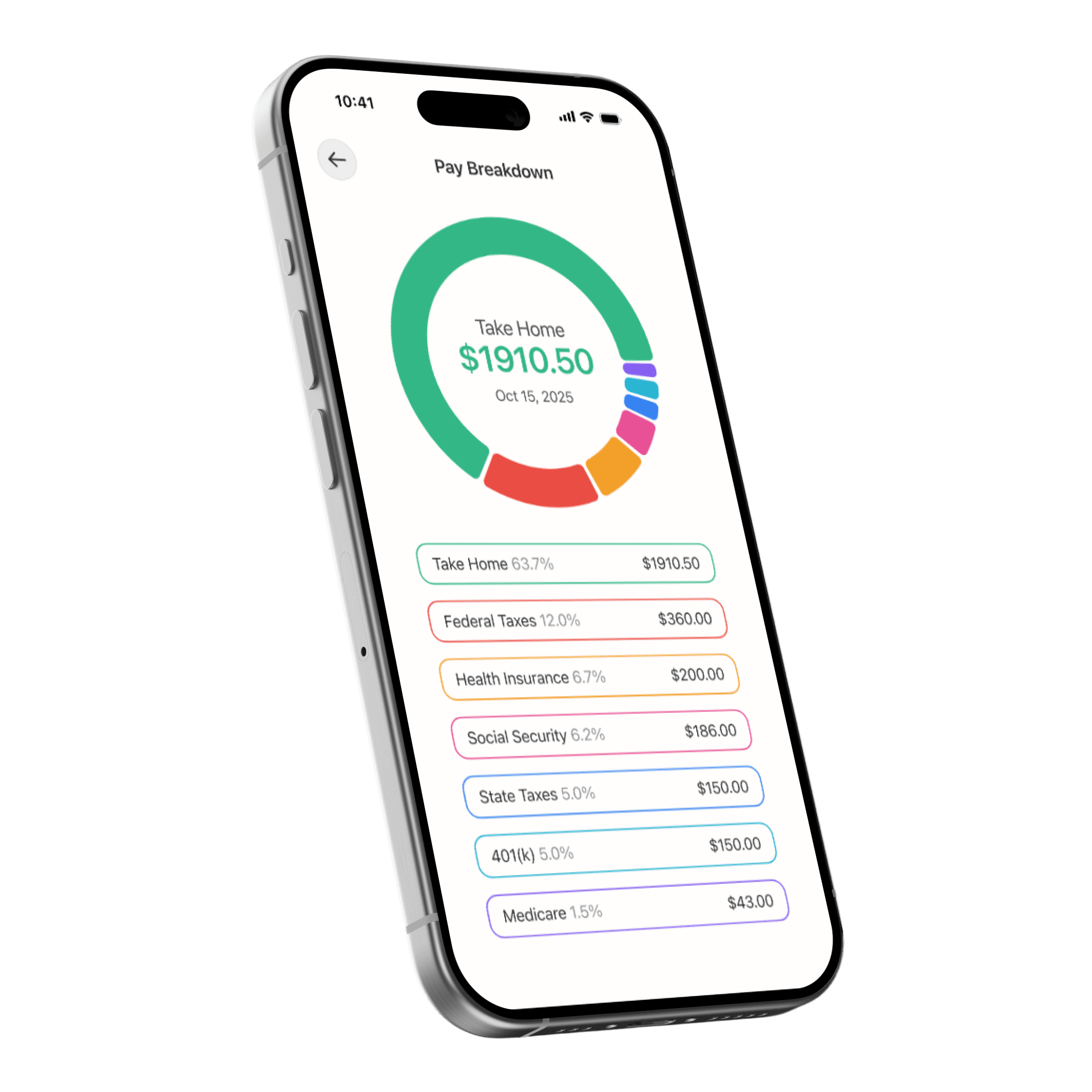
Mobile users feel overwhelmed by 'flat' data. Engagement increases when users can customize their dashboard widgets.
Outcome
Reframed the engagement problem from a usability issue to a personalization gap — delivering research implications that centered hourly worker identity and value in ADP's FY26 product strategy.